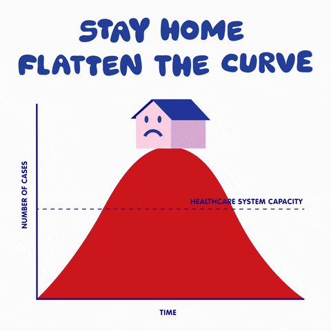
As of today, most countries are on lockdown; a strategy devised by governments to help slow down the spread of the novel coronavirus COVID-19. Moreover, officials use the term flattening the curve to help the healthcare system cope with the expected large amount of patients, but what does that mean mathematically? I will go on an overview of how to construct a useful toy mathematical model to get a qualitative view of the dynamics of the virus.
This is a typical SIR model appearing a lot lately in the media. I will go further to explain how to develop such a model and explain the power and limitations of such models.

This is a typical SIR model appearing a lot lately in the media. I will go further to explain how to develop such a model and explain the power and limitations of such models.
How to construct SIR models
SIR stands for Susceptible, Infectious and Recovered (or Removed) agents. In our example, the agents are humans spreading the disease to each other. To simplify things, we model an agent as a node and the links between nodes represent social connections, as seen in the picture below:
 |
Figure 1: Modelling humans as nodes with links as social connections |
Now, let us assume a population size of N. In the population, we have three different types of agents. Susceptible (S), who haven't had the disease and can get infected. Infectious (I), an agent capable of spreading the disease, and lastly a removed agent (R), which is an agent transformed from the infectious state. The point of putting a recovered node is to illustrate an agent incapable of getting infected, either by building immunity to the disease, or rather sadly, by death. Putting it a bit more formally, The total population (N) can be expressed as:
N=S+I+R
Now it is time to imagine the dynamics between these simplified humans. It is always good to start simple, even a little bit too naive maybe, but build up complexity from there. One simple approach to modelling the dynamics is illustrated graphically below:
 | |
|
An infected agent will transmit the disease to a susceptible agent at some rate named "tr". Over time, the infected agent will either recover or die, at some rate we name "re". For a disease to be effective at spreading, the transmission rate, tr, has to be higher than the recovery rate, re. It has been estimated that the transmission rate is roughly two times higher than the recovery rate for COVID-19.
It is time now for actual modelling. Looking at the graph, for each unit of time, the number of infected people get increased at a rate of "tr" proportional to the number of links between infected and susceptible nodes. On the other hand, the number of infected people gets decreased at a rate of "re". This could be represented as a differential equation:

But how do we estimate the number of links between infected and susceptible nodes? For simplicity, we could assume that most nodes have approximately the same number of links. Then, the number of links between infectious and susceptible nodes is approximately:


This is called the mean-field approximation (for more information, check out this page). Think of z as the average number of social connections of an average citizen. Now, we have transferred the model from the language of nodes to the language of differential equations to be solved later. We carry on translating for the other node types (susceptible and recovered). Since we know that the number of people in the population is conserved (e.g. N=S+I+R), then we know that the rate of change of all node types has to add up to zero, thus:


Which is our system of ordinary differential equations to be solved.
Does social distancing work?
How effective is social distancing? let us play with the model we just developed. Since we assumed z to be the average number of links of the network, one can see the effect of changing our daily social connections by altering the value of z in the model. Let us also keep the ratio of transmission rate to recovery rate to be around 2, then we can use GeoGebra to solve the system of differential equations over time and plot the result. Note that the red curve (proportion of infected people) is our main interest here, the blue and green curves represent the proportion of susceptible and removed agents, respectively. One can see the dramatic change of the steepness of the curve by sliding AvgLinks:
How accurate are these models?
This model is way too simplified, we assumed that all agents have the same number of links, which is probably untrue. Moreover, we haven't taken into account the age group of these agents (which probably makes a huge difference to the Removed variable) and many more factors needed to be added. With that being said, the model gives a nice qualitative view on which factors are the most effective of changing the curve. If you are interested in altering the model, you can access it here.
Comments
Post a Comment